Construction projects fail not because of bad people, but because of broken communication. Teams send RFIs over email, log site instructions on WhatsApp, track defects in spreadsheets, and resolve change requests over verbal conversation. When something goes wrong — and it always does — there's no audit trail, no clear owner, and no single version of the truth.
RIB Hub Process Management was built to fix that. It's a collaboration tool that lets construction organisations digitalise their workflows — creating, assigning, tracking, and communicating tasks across the entire project lifecycle, from pre-construction through to handover.
Whether it's a simple to-do, a multi-step RFI, or a complex variation order, everything lives in one place with full auditability.
I joined the project in September 2024, nine months into a tool that had an early foundation but needed significant expansion.
What I inherited was a task management core. What I helped build was a fully realised product — refined workflows, two major new features, a mobile experience, and a cross-product integration strategy.
Co-designer Collaborated closely with a designer based in Denmark — dividing work by feature area while maintaining a tight peer review loop throughout. As the product matured, ownership was formally structured: I now own the mobile platform end-to-end, while my colleague leads web design.
Ways of working Embedded in the full agile delivery cycle — bi-weekly sprint planning, sprint demos, and retrospectives alongside the PM and engineering team
Design system Construct — RIB Hub's internal design system.
Web components inspired by Chakra UI; mobile components inspired by Material Design
Role Senior Product Designer
Duration 9 months (September 2024 – present)
Team 4 (core product) — 2 Product Designers, 1 Product Manager, 1 Product Owner + ~8 Engineering, QE, and SecurityMarketing Engg, 1 Dev Lead)
Contribution
Interaction Design — 100% (web: Observations, Site Diary, task drawer refinement; mobile: full platform)
Research — 60% (conducted 2–3 pilot interviews; co-synthesised all 10 sessions)
Visual Design — 80%
1.Getting up to speed — understanding what existed and why
When I joined, the task creation and task template workflows had already been designed. My first job wasn't to redesign — it was to understand. I worked through the existing designs, traced the flows, and identified which decisions were still valid and which needed revisiting.
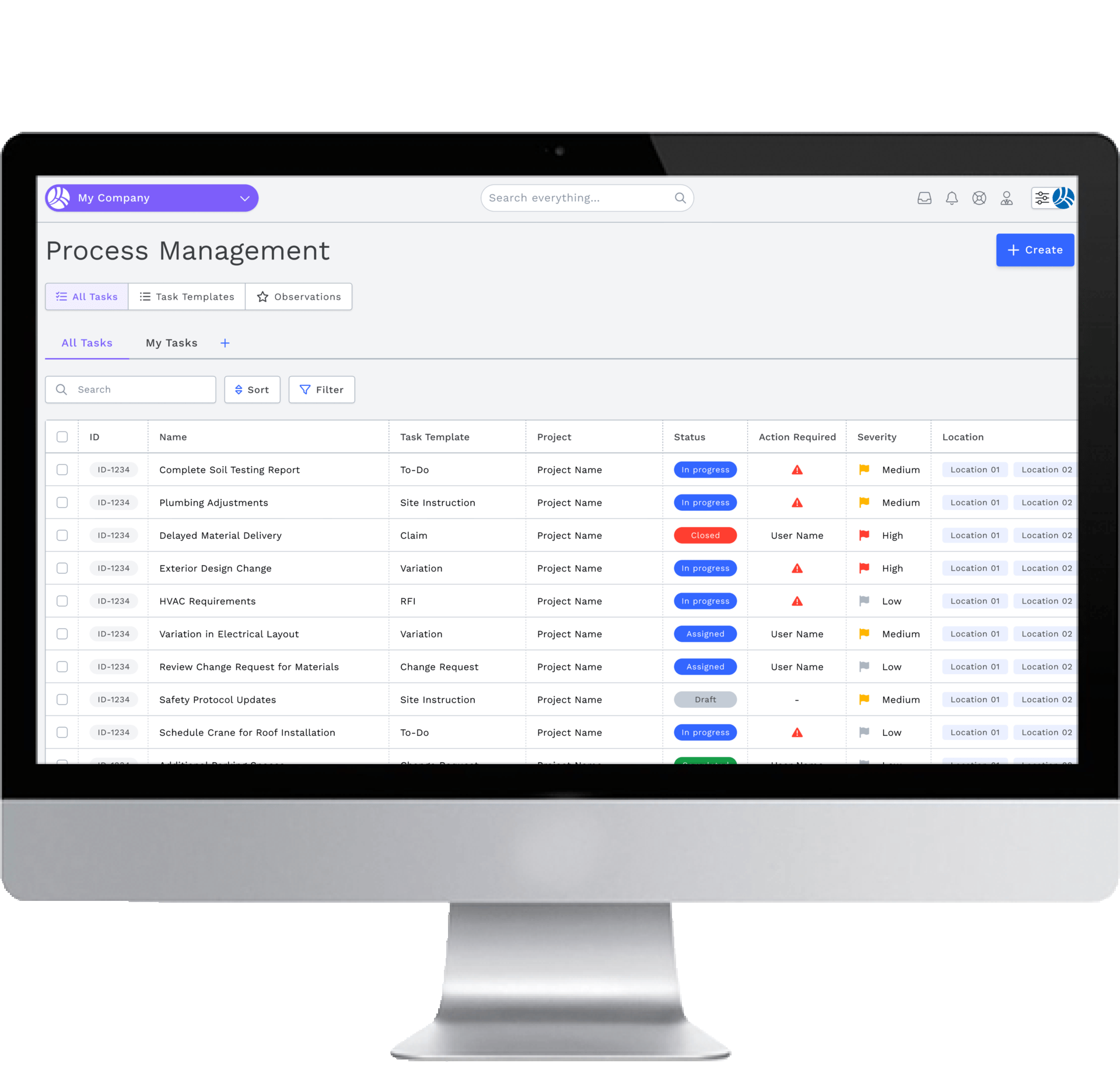
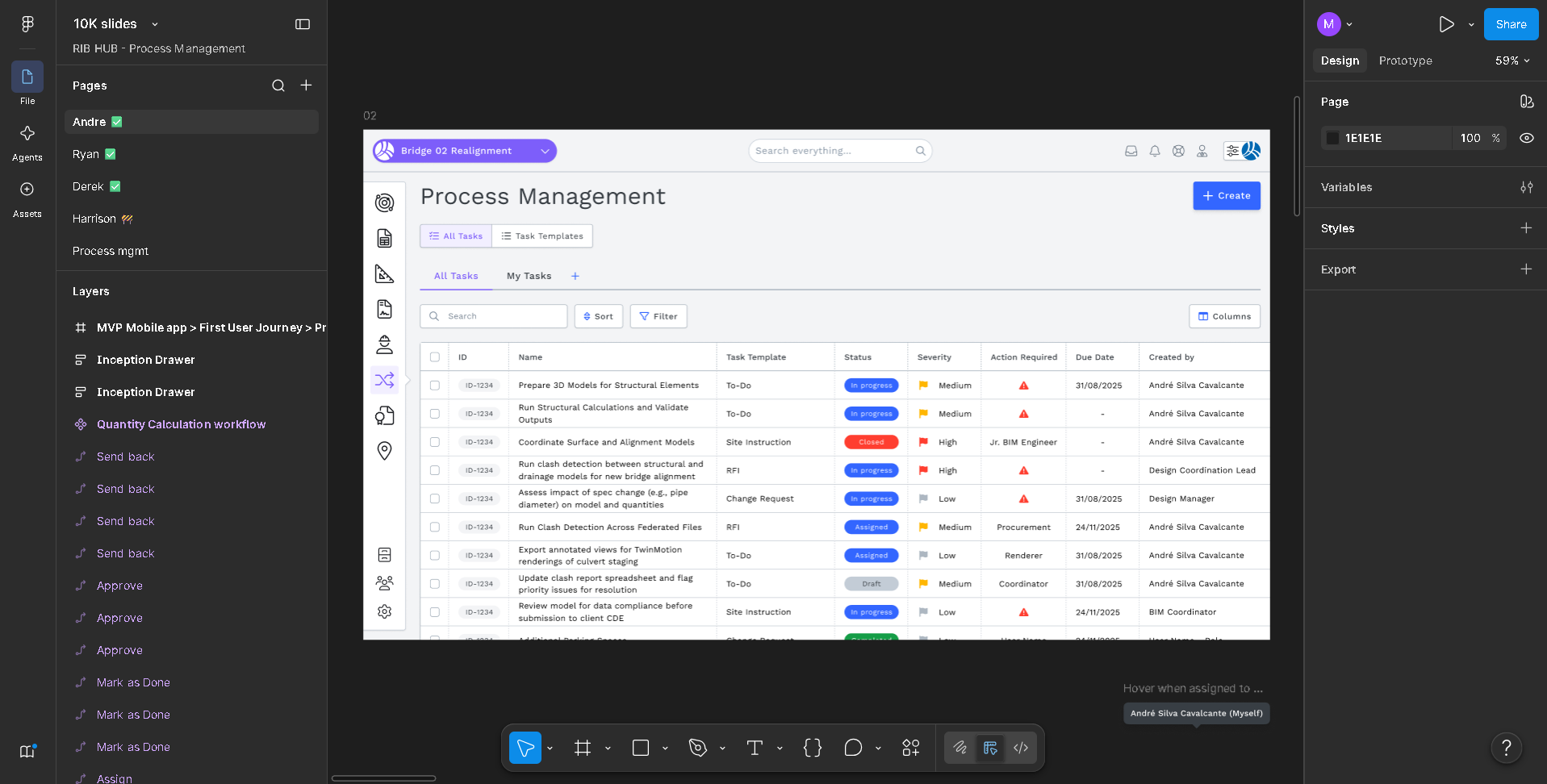
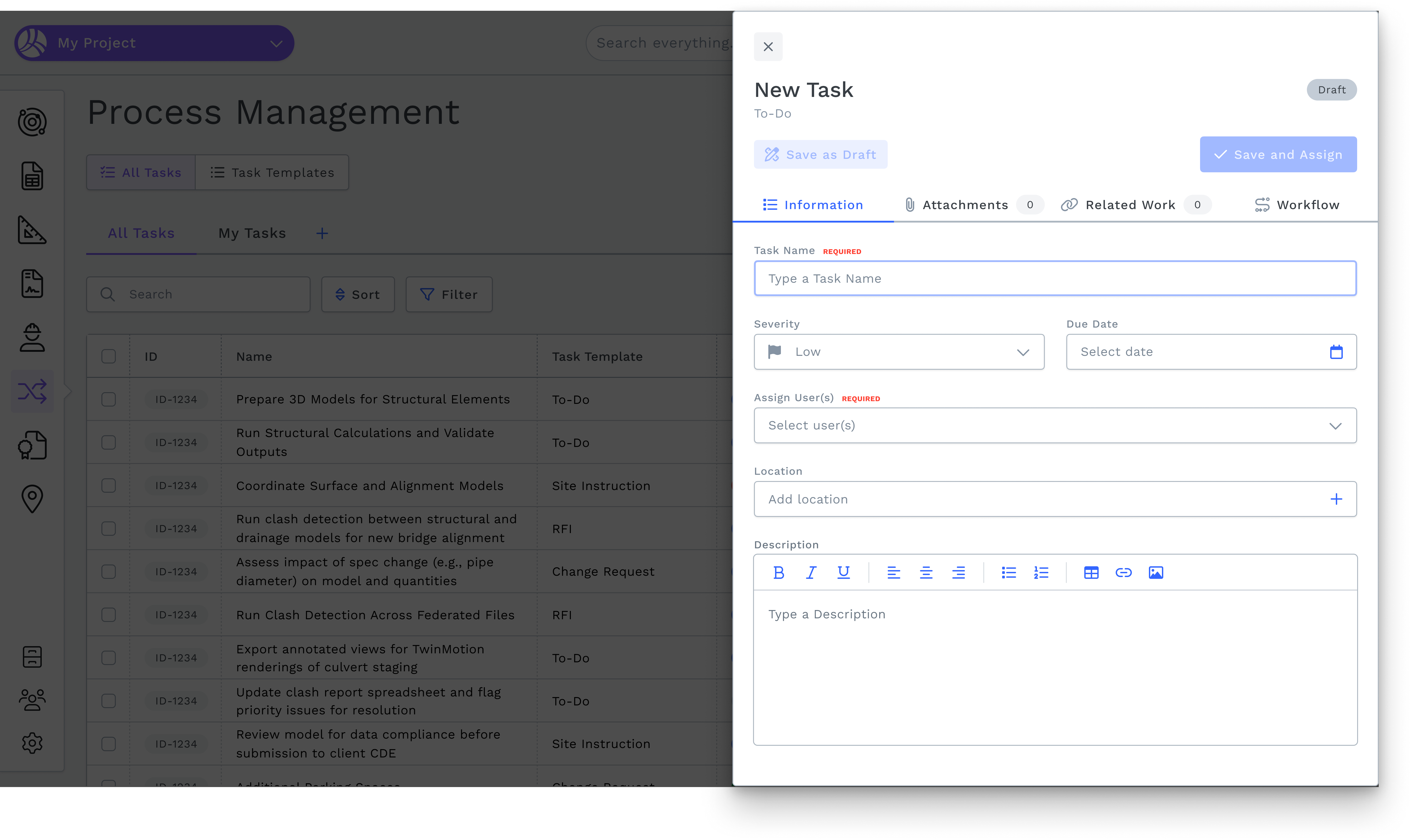
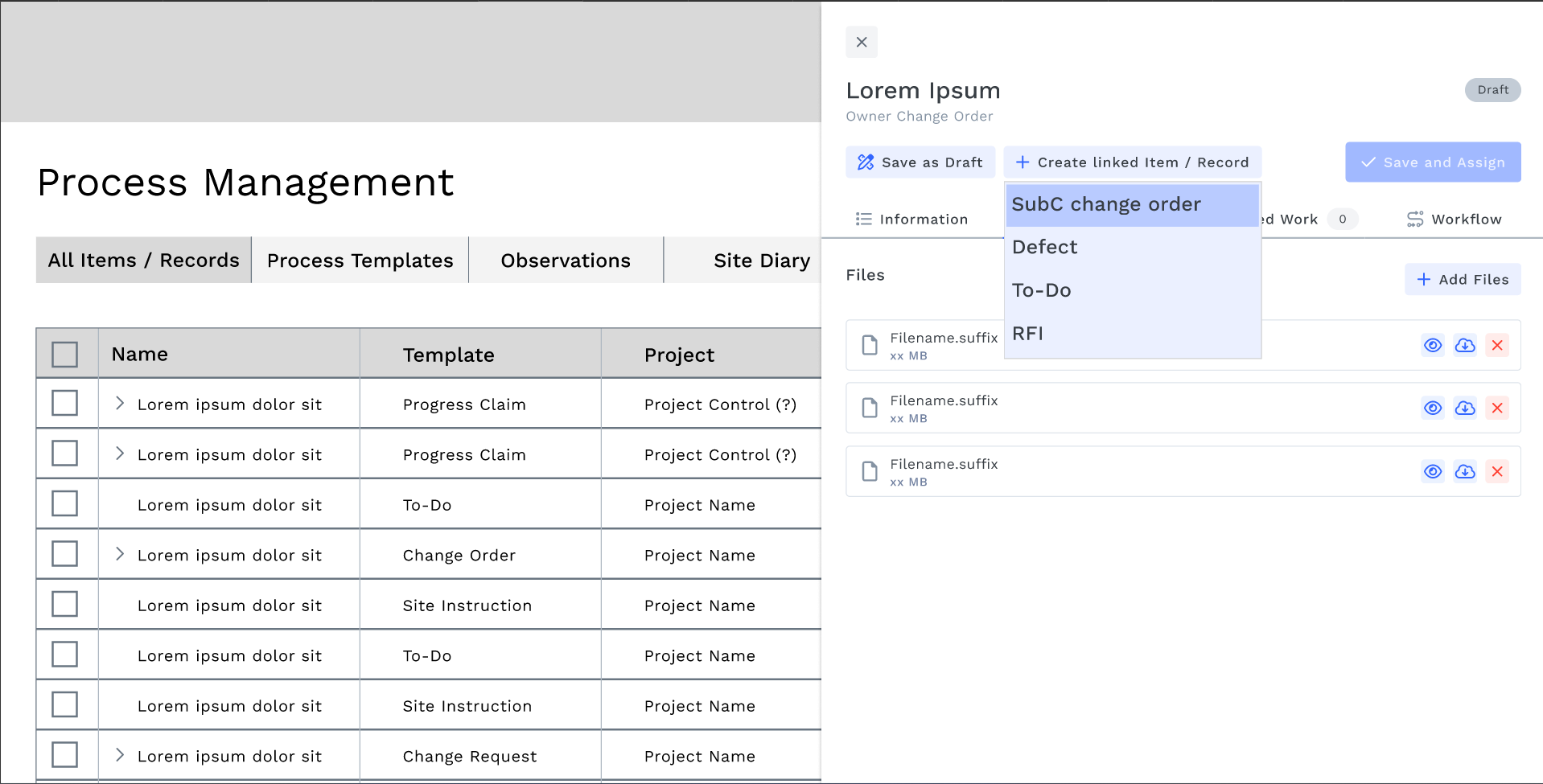
The core task drawer had accumulated complexity. It had five tabs — Information, Attachments, Related Work, Workflow, and Activity Log — and a header crowded with competing action buttons: Cancel Task, Export to PDF, Save as Draft, Save and Assign. Users had no clear hierarchy of what to do next.
This diagnosis gave me a concrete starting point: before expanding the product, the foundation needed to be cleaner.
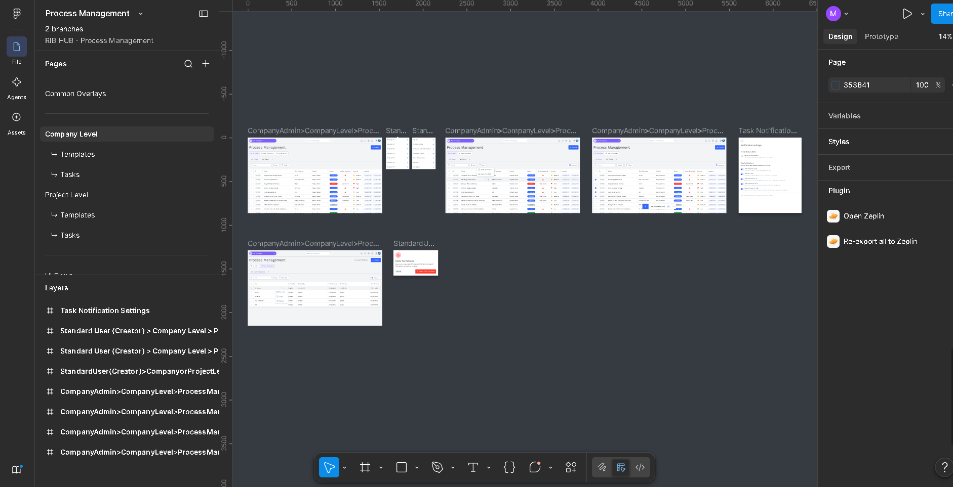
Existing Figma design
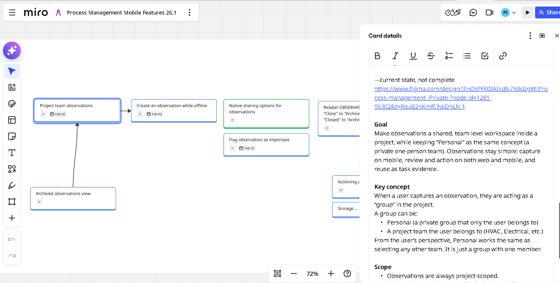
Miro Board
2.Pilot research — validating problems before designing solutions
Rather than designing in isolation, the team ran a structured pilot programme with construction professionals across Europe. I co-facilitated sessions alongside the Product Manager, conducting 2–3 interviews myself and contributing to the synthesis of all 10.
The programme ran in two formats:
Problem Validation (20K format) —
We presented four core business problems and asked participants to rank them by relevance: disconnected processes, poor ownership visibility, unreliable field data, and no single source of truth. This session grounded every subsequent design decision in real industry pain.
Hands-on Prototype Testing (10K format) —
Participants worked through the tool with real tasks. We observed where they got stuck, what they reached for instinctively, and what they said out loud when the tool did — or didn't — match their mental model.
Participants included:
Derek O'Neil, Director at Careys — extensive site experience across concrete frames, shopping centres, and residential projects
André, BIM Engineer at Wills Bros — pre-construction and procurement focus
What we heard:
"One of the most important things is to be able to keep the information in one single place and then we can go through and understand what was happening."
"For me it is about clarity around what the task is and who's to complete the task and by when."
"If we have some kind of highlighting or something, that would be helpful." — on managing multiple concurrent deadlines
"I can use your interface to create my own workflow and then improve it in the future, change it completely." — on the value of configurable templates
I synthesised research findings using Dovetail's AI co-pilot, tagging insights by theme and surfacing patterns across sessions — a significant improvement over manual synthesis, which I had used on previous projects.
One early evaluation worth noting: I investigated whether designs needed to be produced in German to support localisation for the DACH market. After evaluating Phrase — a translation management platform — I confirmed that localisation happens entirely at the development layer. No parallel design work in German was needed, freeing the design process to focus on a single, well-considered English-language experience.
Dovetail Copilot
Figma prototype
3. Simplifying the task drawer — less surface, more clarity
The pilot confirmed what the existing design suggested: the task drawer was doing too much with too little hierarchy.
The problems:
1. Five tabs competing equally for attention
2. The Workflow tab showed a flowchart that users found abstract and disengaging
3. The Activity Log sat as a full tab despite being a secondary reference, not a primary action
4. Action buttons — Cancel Task, Export to PDF, Save as Draft, Save and Assign — were all surfaced at the same visual weight, creating decision paralysis
The changes I made:
1. Reduced tabs from 5 to 4 —
removed the Workflow tab entirely; workflow state is now communicated contextually through the task status badge and the available action buttons
2. Elevated Discussion —
replaced Activity Log as a full tab, but transformed its purpose: Discussion is now where users both communicate and act. They can comment, add attachments, and complete the task — all without switching context
3. Consolidated action buttons —
a single primary action (e.g. "Mark As Done") sits prominently in the header. A chevron dropdown reveals the destructive action (Cancel Task, in red) one level deep. The ⋮ overflow menu holds utility actions — Export to PDF and Activity Log — keeping the header clean without removing functionality
Comment & Mark As Done — a combined action at the bottom of the Discussion tab lets users close the loop in a single gesture: leave a note and advance the workflow simultaneously
What users said after:
"Instead of accepting and clicking Done, I can insert some comments here in discussion, I can insert some attachments if I want and then send it back."
"If you start discussing some challenges or issues... we can discuss using that feature and track what was agreed and new ideas and solutions. It'll be fantastic."
"This simple possibility to see the details regarding the activity that I'm about to start — in my point of view, is extremely helpful."
Before Task drawer
After Task drawer
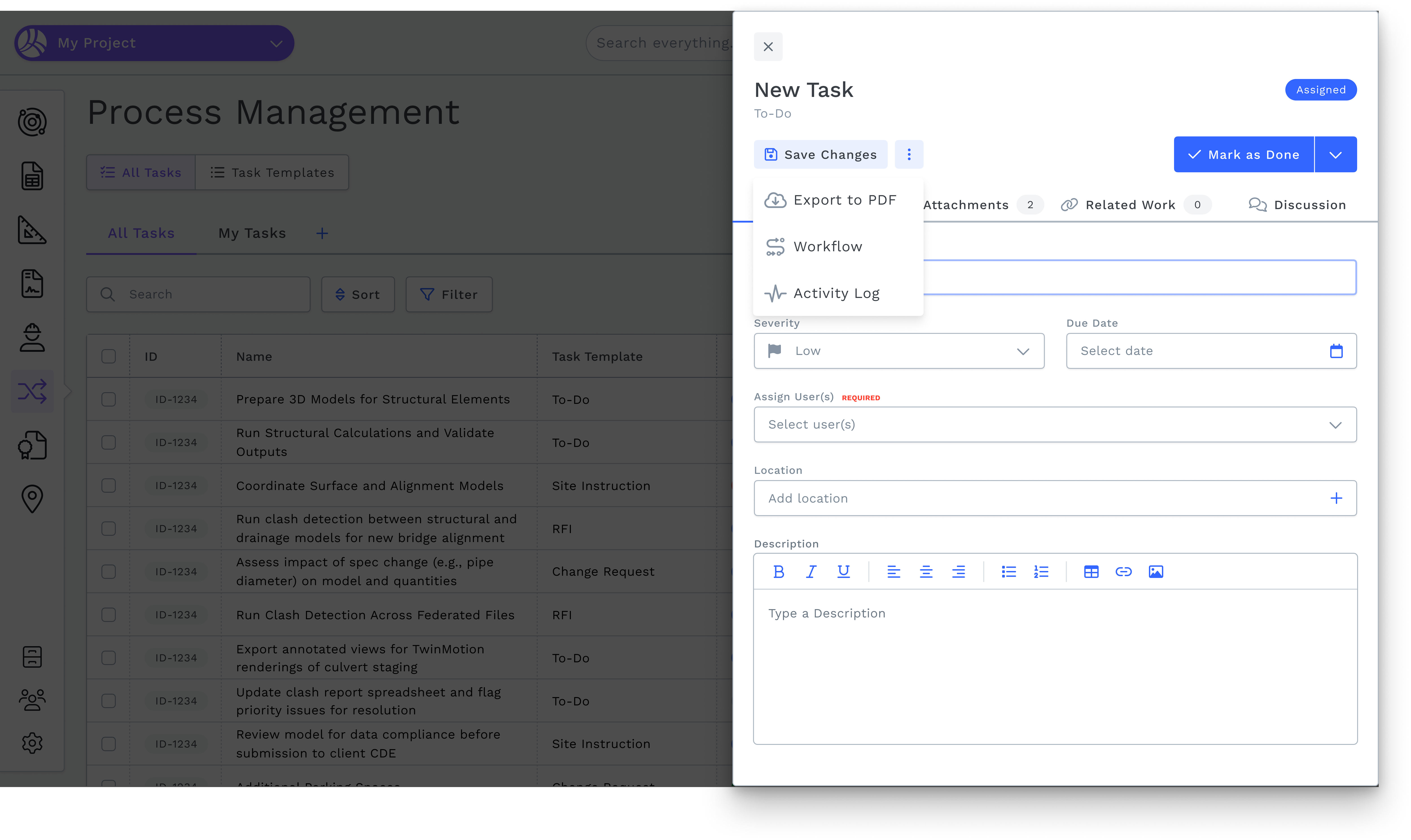
4.Designing Observations — field capture meets task management
Observations was a net-new feature. On construction sites, issues are spotted in the moment — a crack in a wall, a safety hazard, a deviation from spec. The current reality: a photo taken on a phone, sent to a WhatsApp group, and promptly buried. No record. No owner. No action.
I designed the Observations flow for both web and mobile — using RIB Hub's Construct design system throughout, with the web implementation drawing on Chakra UI components and the mobile implementation on Material Design patterns.
The two platforms serve different but connected purposes.
Web — visibility and action
On the web, Observations live as a card grid under the main Process Management navigation. Each card represents one observation — a flat card for a single image, a stacked card for multiple. Users can filter, flag, archive, and download. Crucially, any observation can be attached directly to a task — creating a traceable link between a site photo and the formal process that resolves it.
Mobile — capture first, everything else second
The mobile experience is built around the moment of capture. Tapping "+ Create" on the Observations tab opens the device camera directly. Users shoot multiple photos in sequence — a thumbnail strip fills below the viewfinder as they go. Once done, they tap Save. The observation is logged instantly, timestamped, and geotagged.
Web Observations
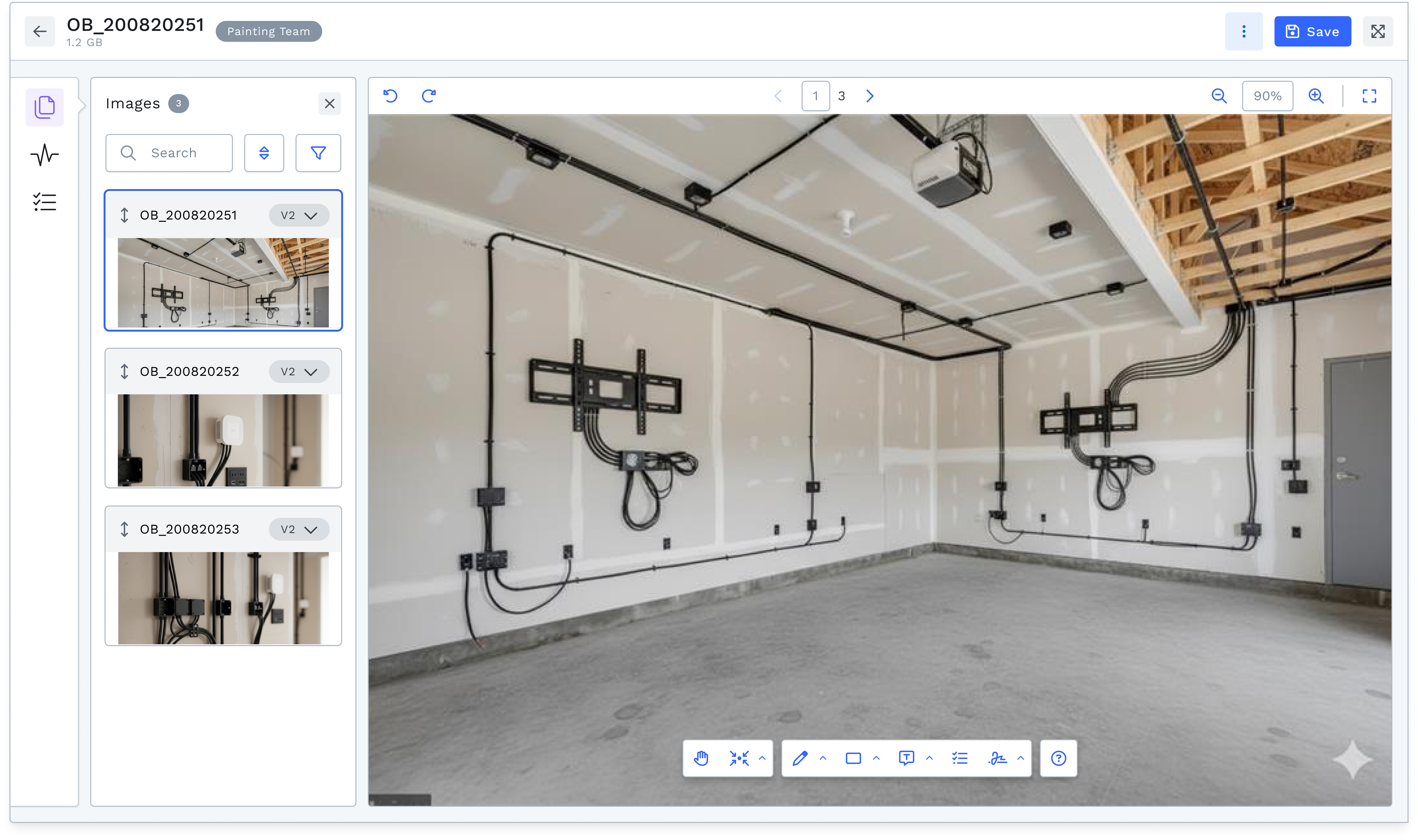
Web-Observation details
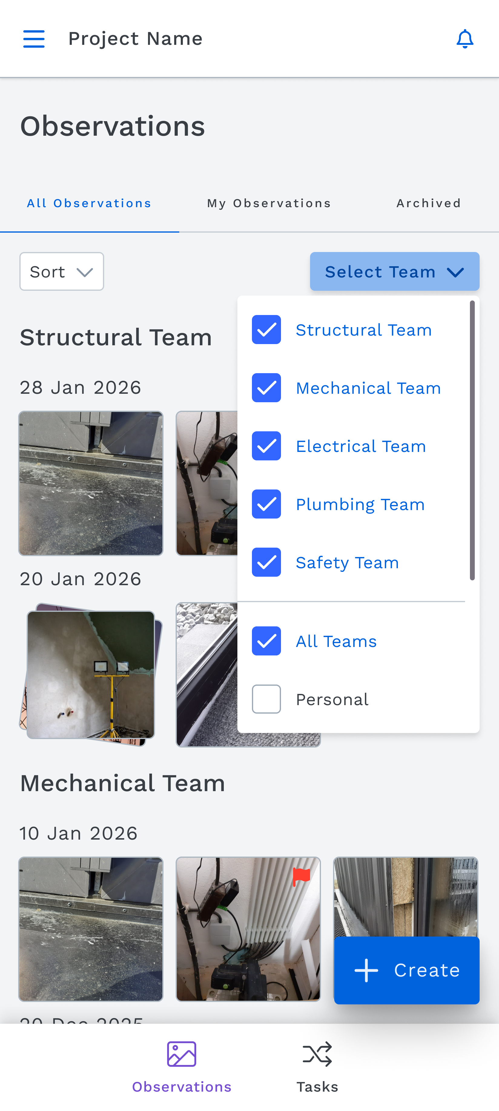
Mobile Observations
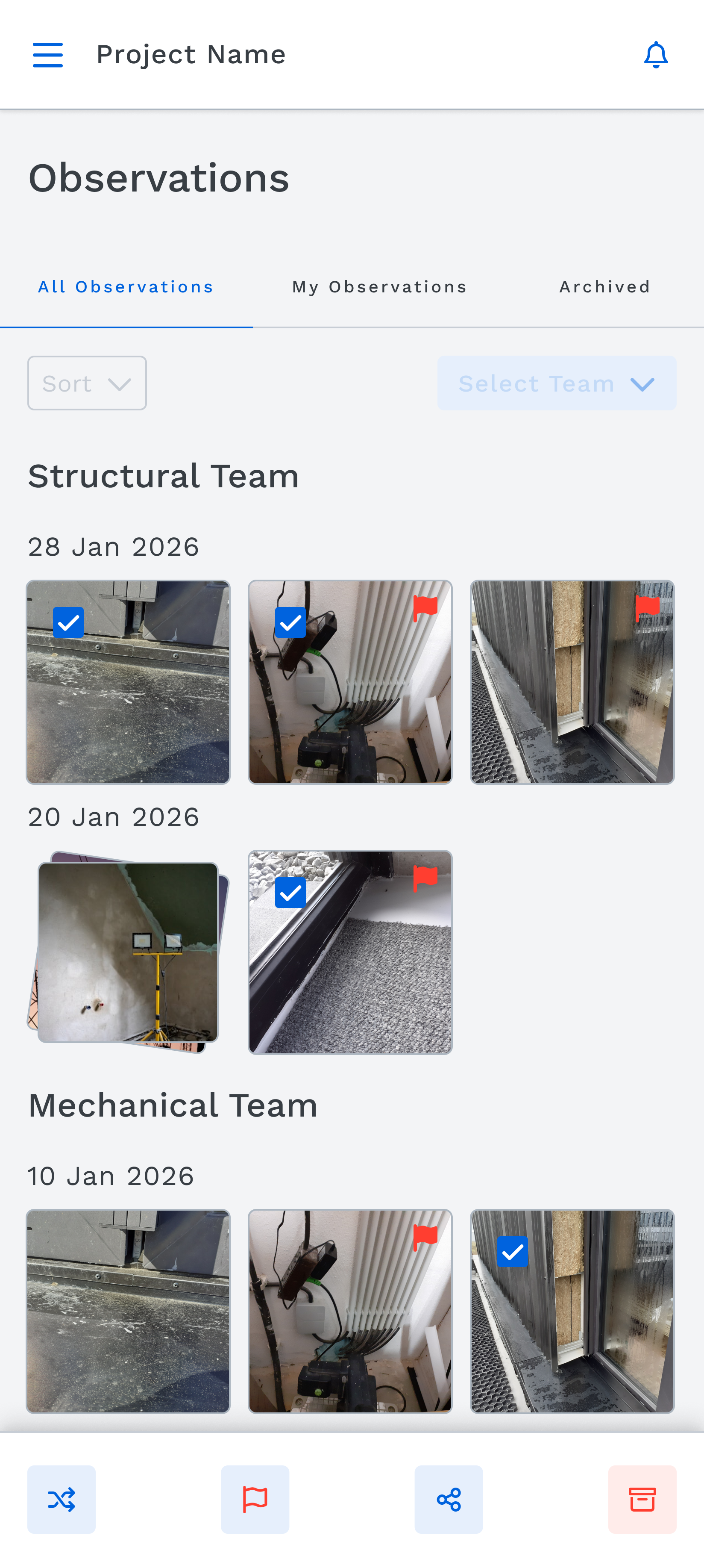
Observations toolbar
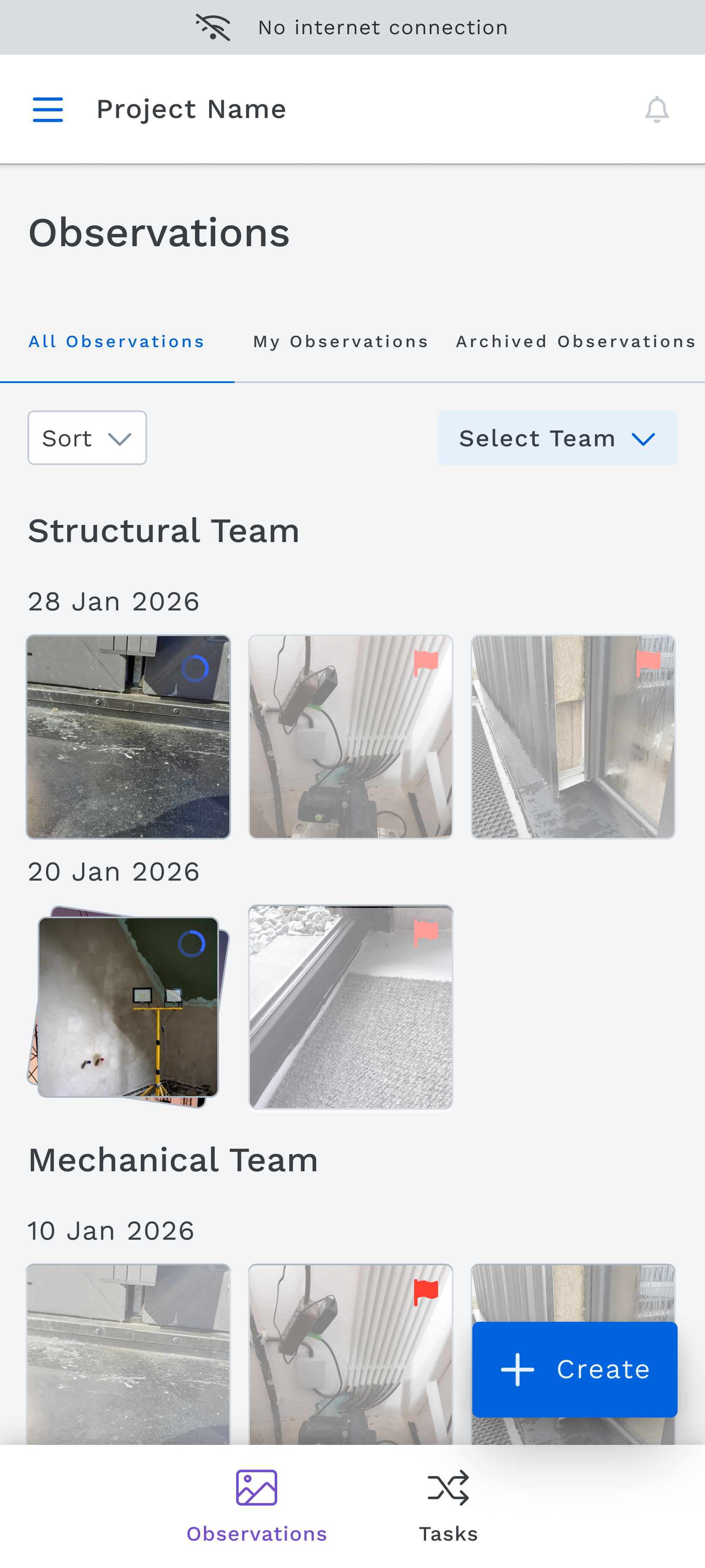
Observations offline
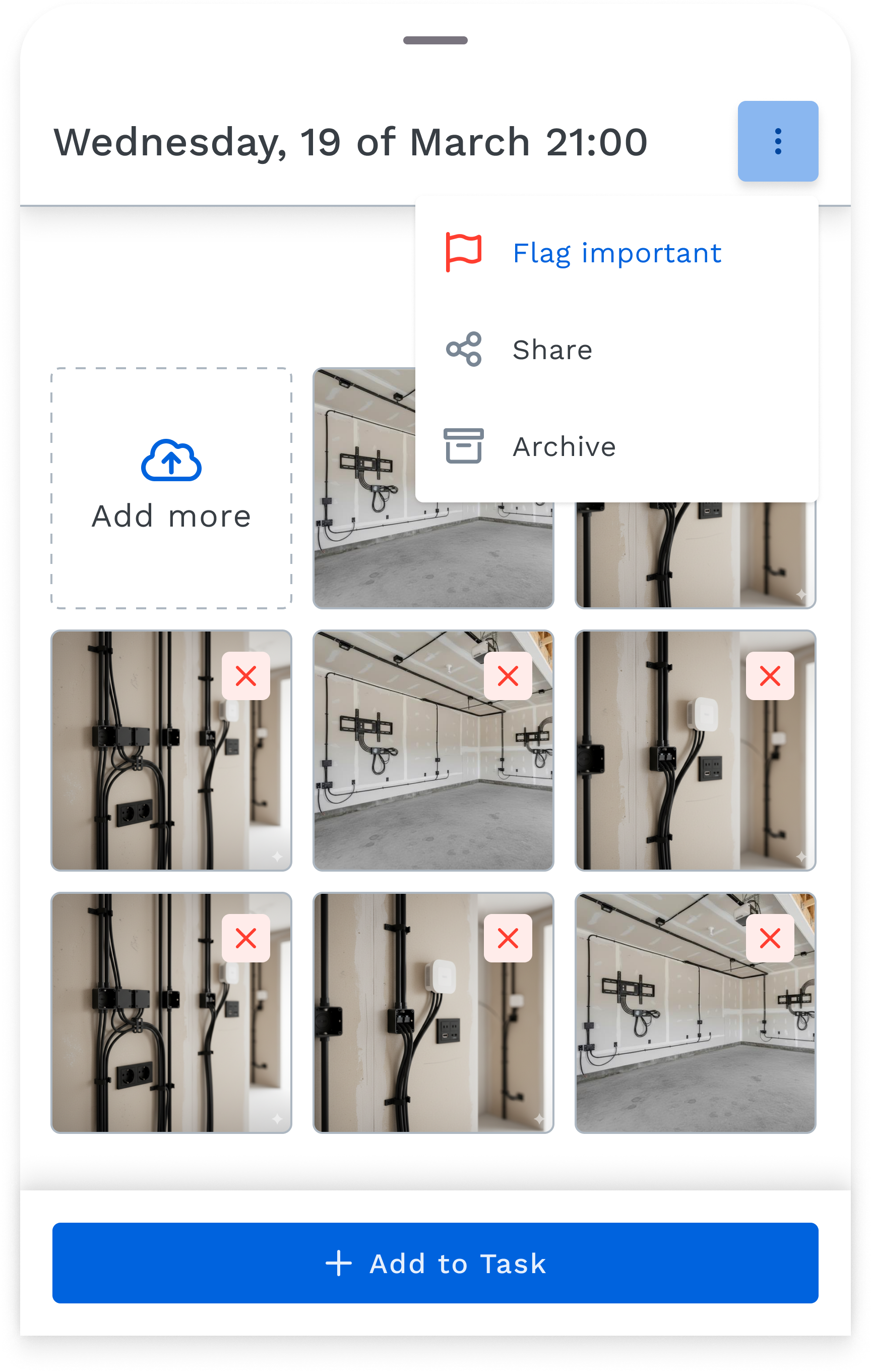
Observations details
5. Designing Site Diary — turning daily site activity into a permanent record
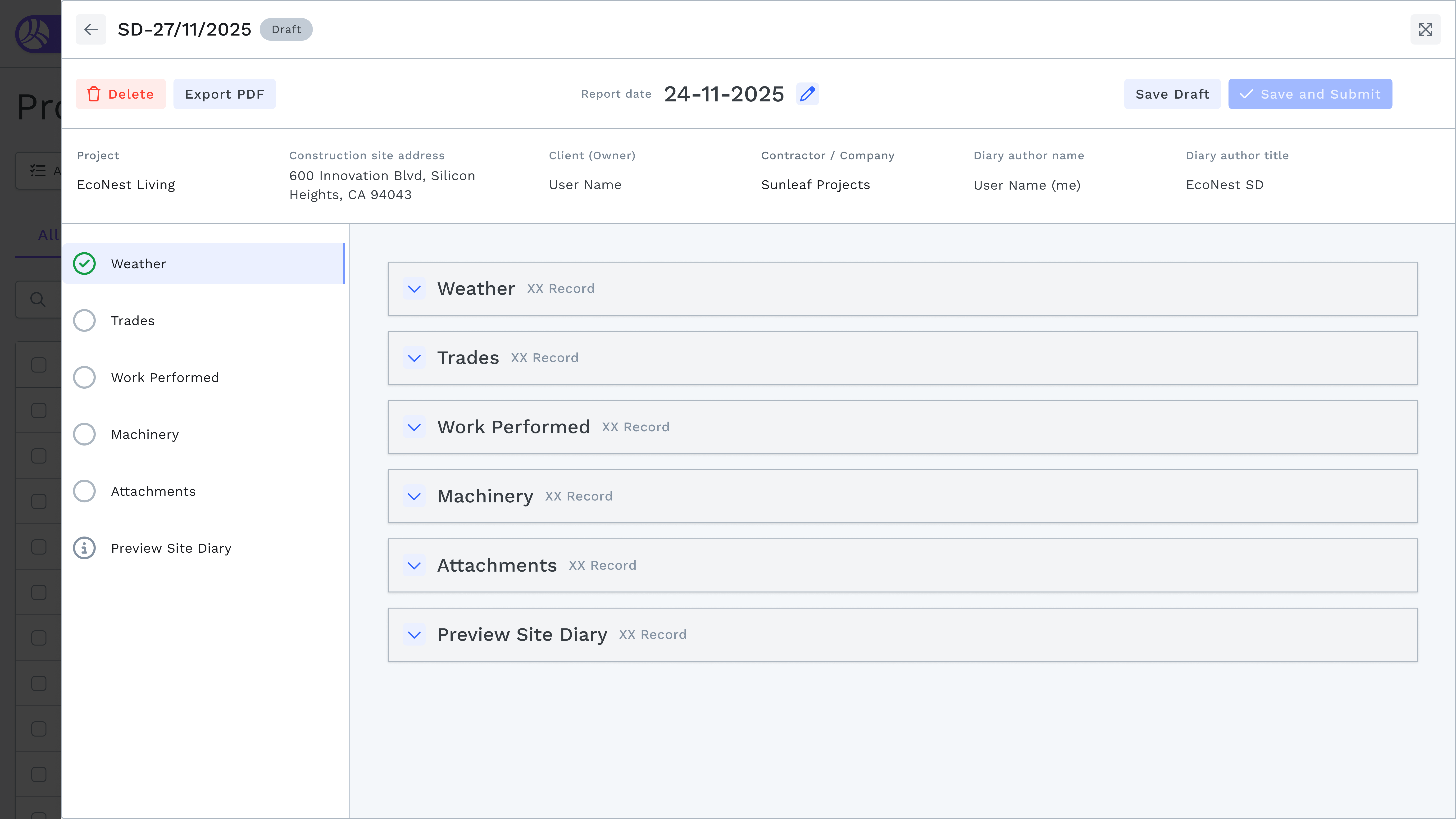
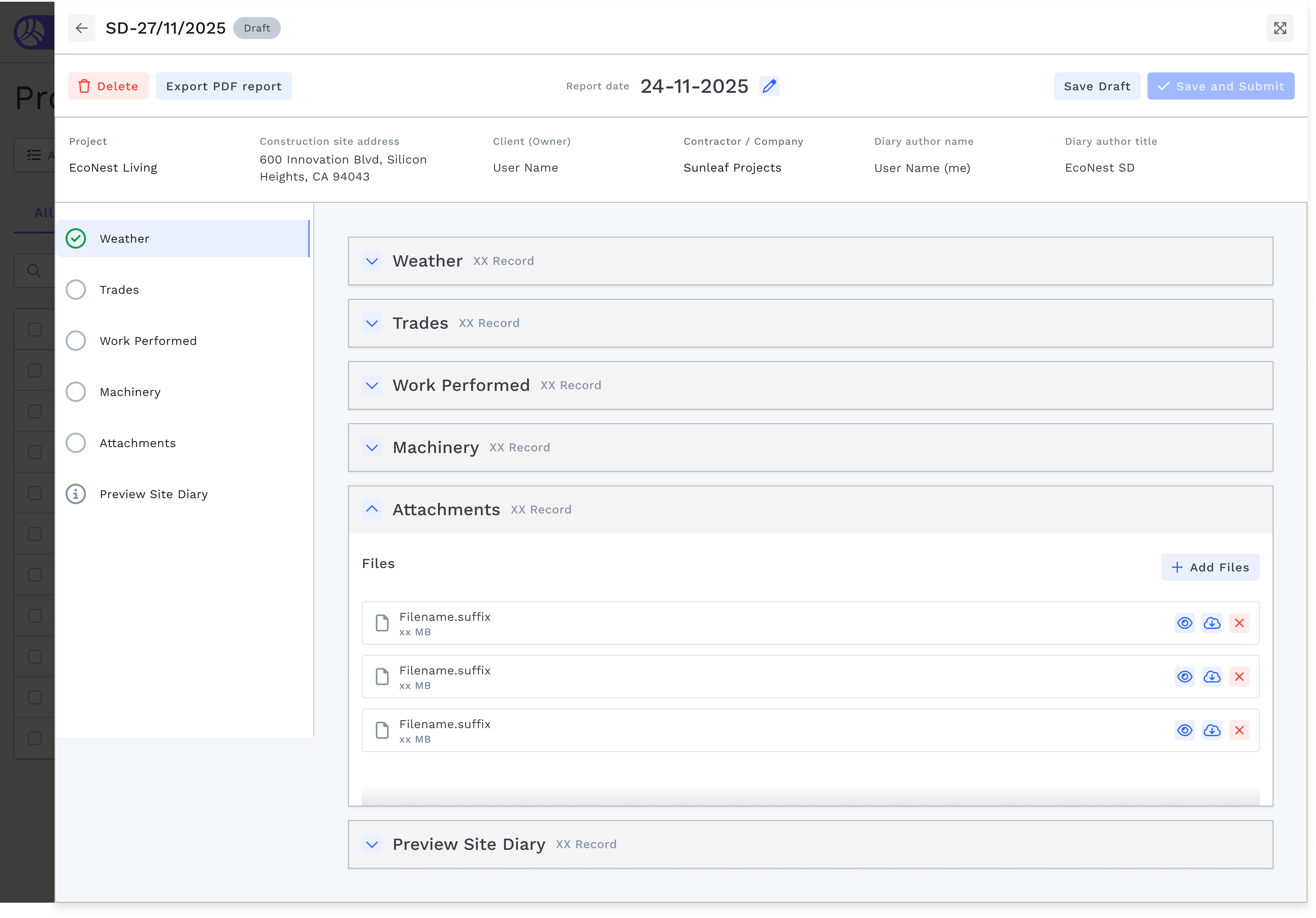
Site Diary was the second major feature I designed for web. On most construction projects, the site diary is a legal document — a daily record of weather, labour, equipment, and work performed.
In practice, it's a paper form filled out at the end of the day from memory, or not at all.
The Process Management Site Diary turns this into a structured digital flow. Using a vertical stepper navigation, users move through five sections: Weather, Trades, Work Performed, Machinery, and Attachments — before previewing and submitting the completed diary.
The weather section auto-populates from a weather API, reducing manual entry and improving accuracy. Each section is an accordion — collapsed by default, expanded on interaction — keeping the full form navigable without overwhelming the user.
Submitted site diaries are immutable records, exportable as PDF, tied to the project date and user identity. They form part of the audit trail that protects contractors in disputes.
Site Diary1
Site Diary2
6. Cape Town — cross-product integration strategy
Nine months into the project, I was selected alongside the Product Manager to travel to Cape Town, South Africa, for a week-long strategic session with the Project Controls team — another major product in the RIB portfolio.
The goal was to identify integration points between Process Management and Project Controls: how could tasks, observations, and site data flow into cost management, scheduling, and reporting workflows?
I contributed design thinking to the integration strategy discussions and presented a demo to stakeholders illustrating one of the key integration concepts — showing how a task created in Process Management could surface as a cost event in Project Controls, closing the loop between field activity and commercial management.
Concept UI flow
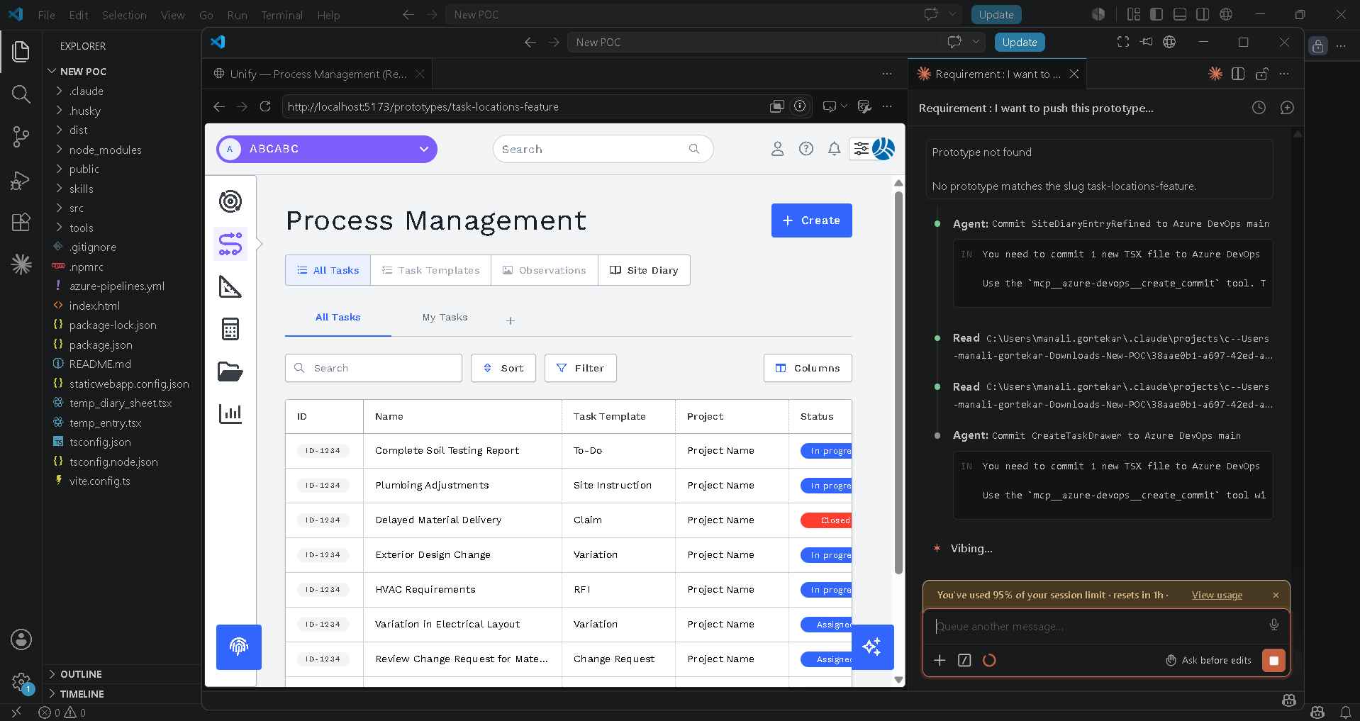
7. AI sprint — prototyping the Task Locations feature in Claude Code
Alongside the pilot research and feature design, I participated in an internal AI sprint with my colleague — building working prototypes using AI-assisted development tools. Not Figma mockups, but functional code that developers could directly reference and build from.
My contribution was a fully working prototype of the Task Locations feature, built in Visual Studio using Claude Code within a week. The feature lets users add structured locations to a task (navigating a Building / Level / Room hierarchy), associate a drawing with that location, and place a precise pin on the floor plan — directly linking a task to a physical point in the building.
The prototype was built with real components, deployed to Azure Static Web Apps, and handed directly to the development team for implementation. It wasn't a throwaway experiment — it became the reference artifact for how the feature should behave in production.
My colleague and I maintain a shared prototype library — Unify — Process Management (Real Components) — where both our AI-built prototypes live alongside each other. This has become an ongoing practice: using AI-assisted development to close the gap between design intent and engineering implementation, reducing ambiguity at handoff and accelerating the feedback loop between design and dev.
Claude code prototype
Process management AI Prototype
Final Design
The final designs were built in Figma using Construct — RIB Hub's internal design system (web: Chakra UI-inspired; mobile: Material Design-inspired). They cover the following core flows:
Web
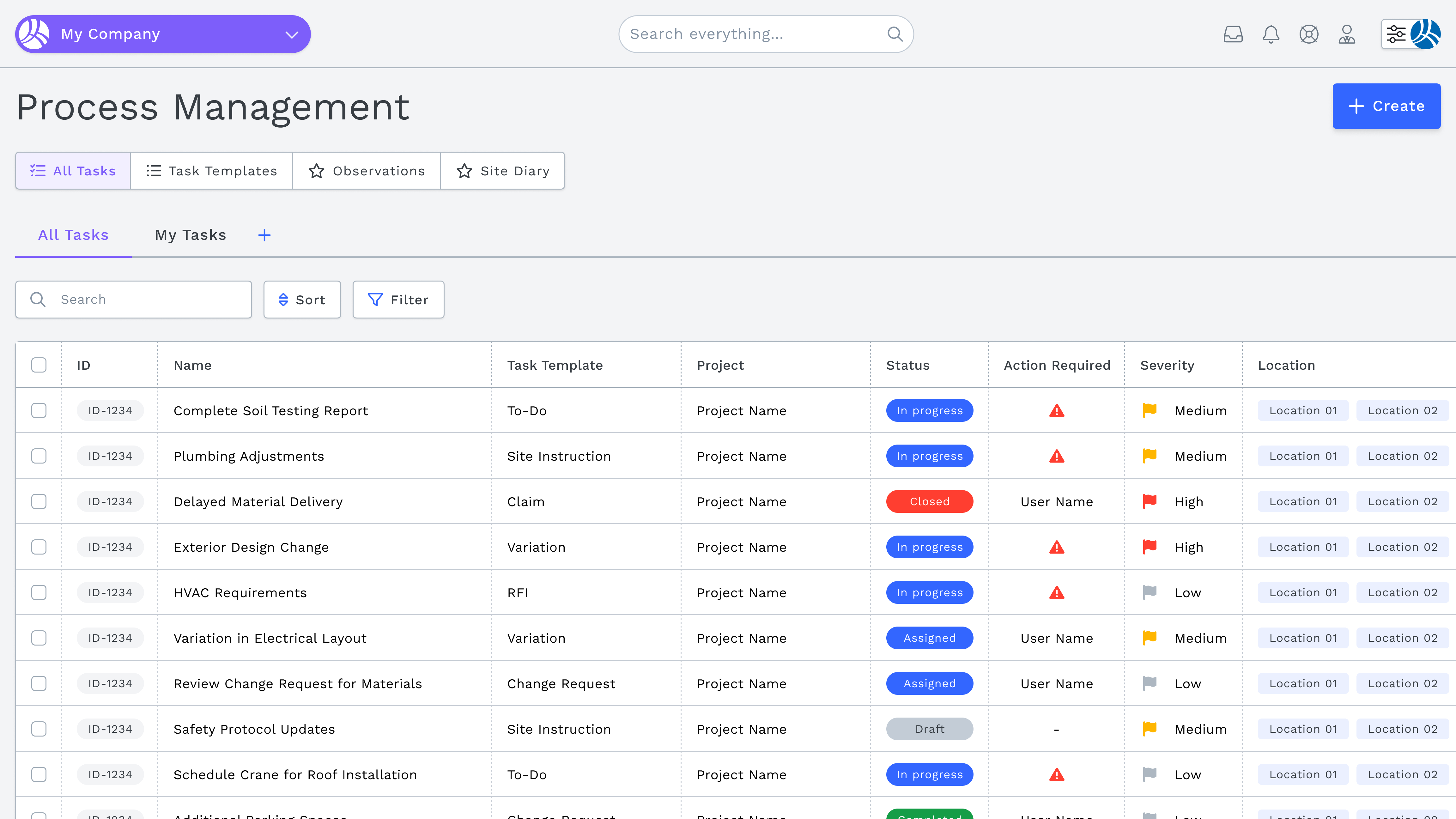
All Tasks —
list view with status, severity, location, and action required
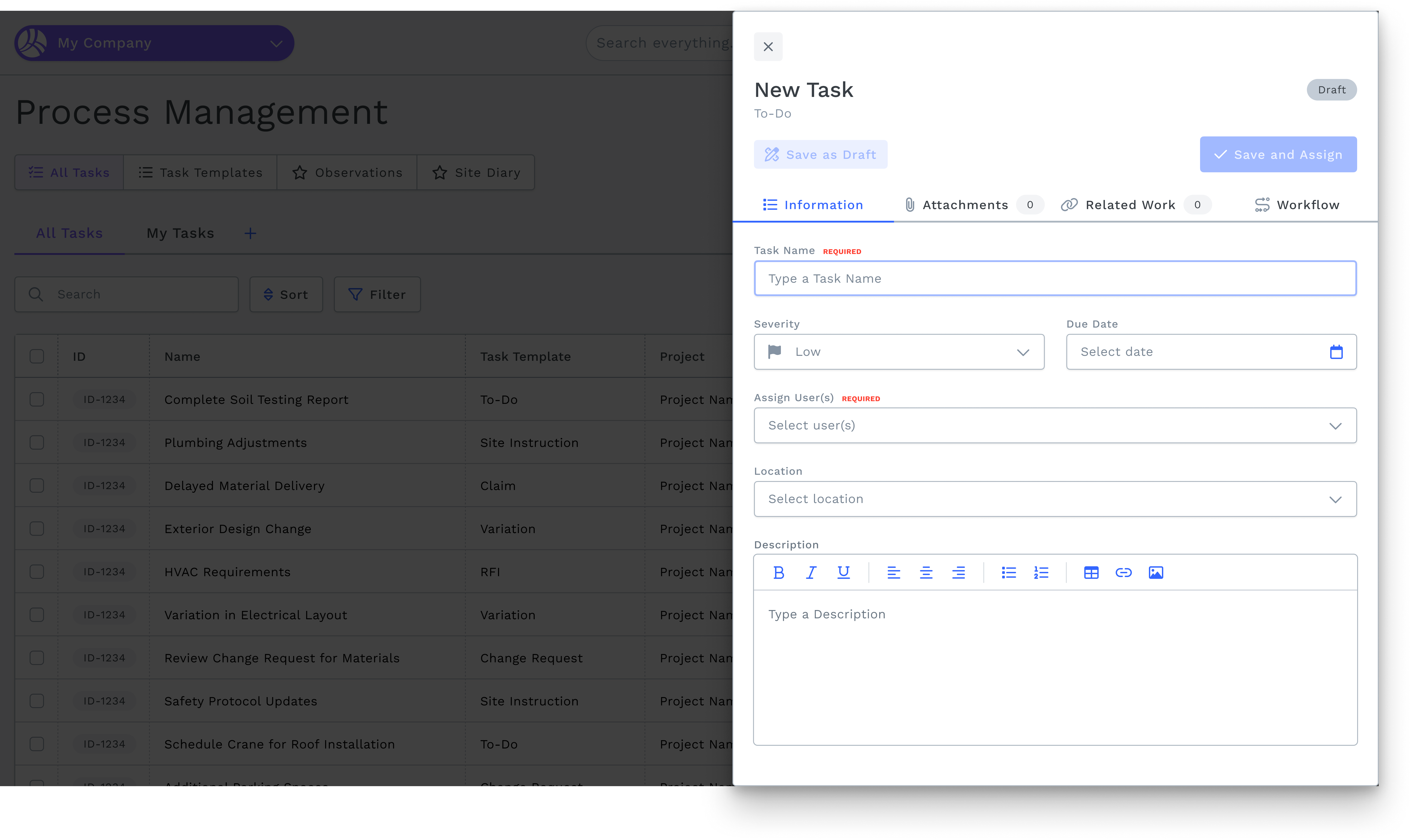
Create Task —
drawer with Information, Attachments, Related Work, Discussion tabs
Task Templates —
configurable workflow builder
Observations —
card grid with flag, archive, download, attach to task
Site Diary —
vertical stepper with weather, trades, work performed, machinery, attachments
Mobile
Task list —
time-grouped (Overdue / Today / Later), accordion expand, severity indicators
Create Task —
task name with voice input, inline attachments, offline mode
Observations —
camera-first capture, multi-photo strip, merge, attach to task
Project switcher —
bottom sheet with company/project grouping
Process management homepage
Create new task
Sign In
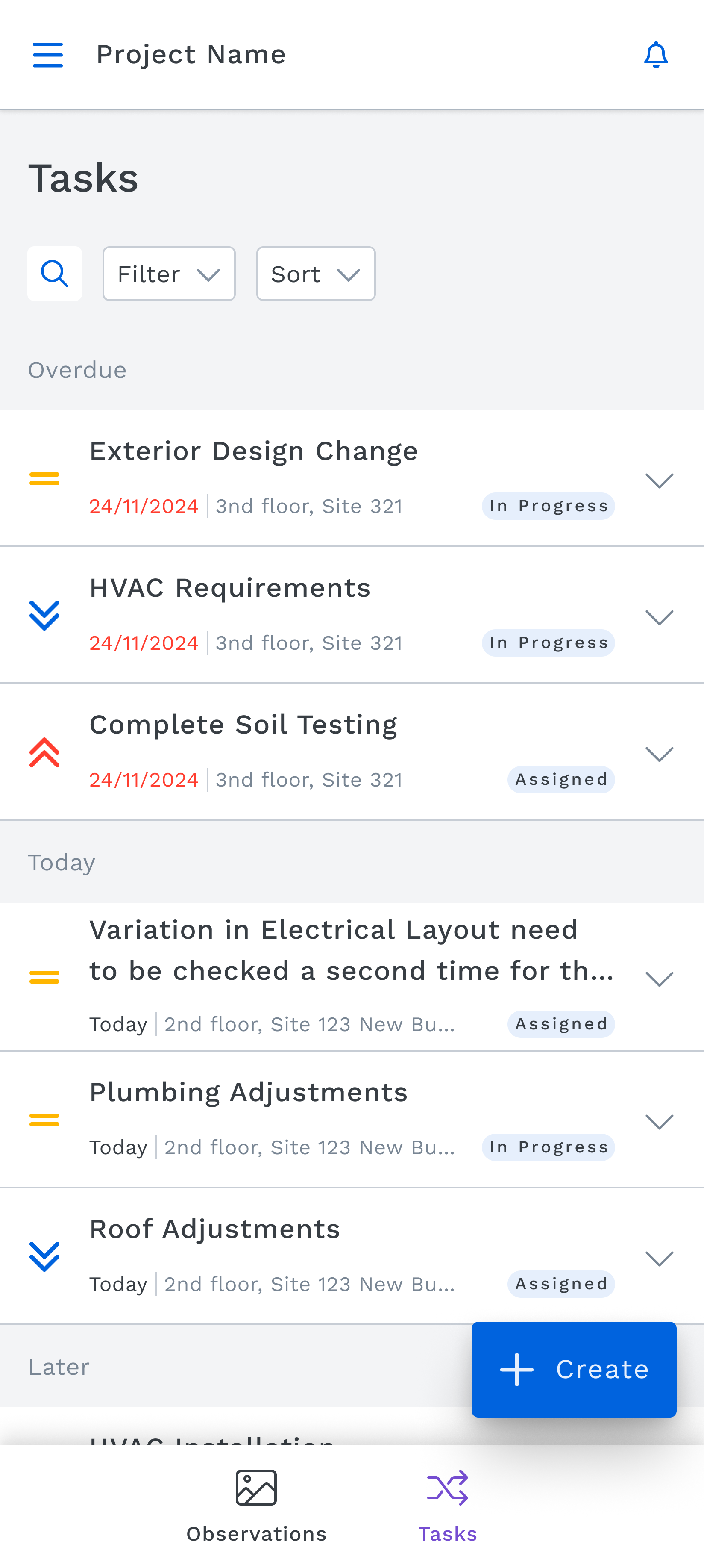
Task list
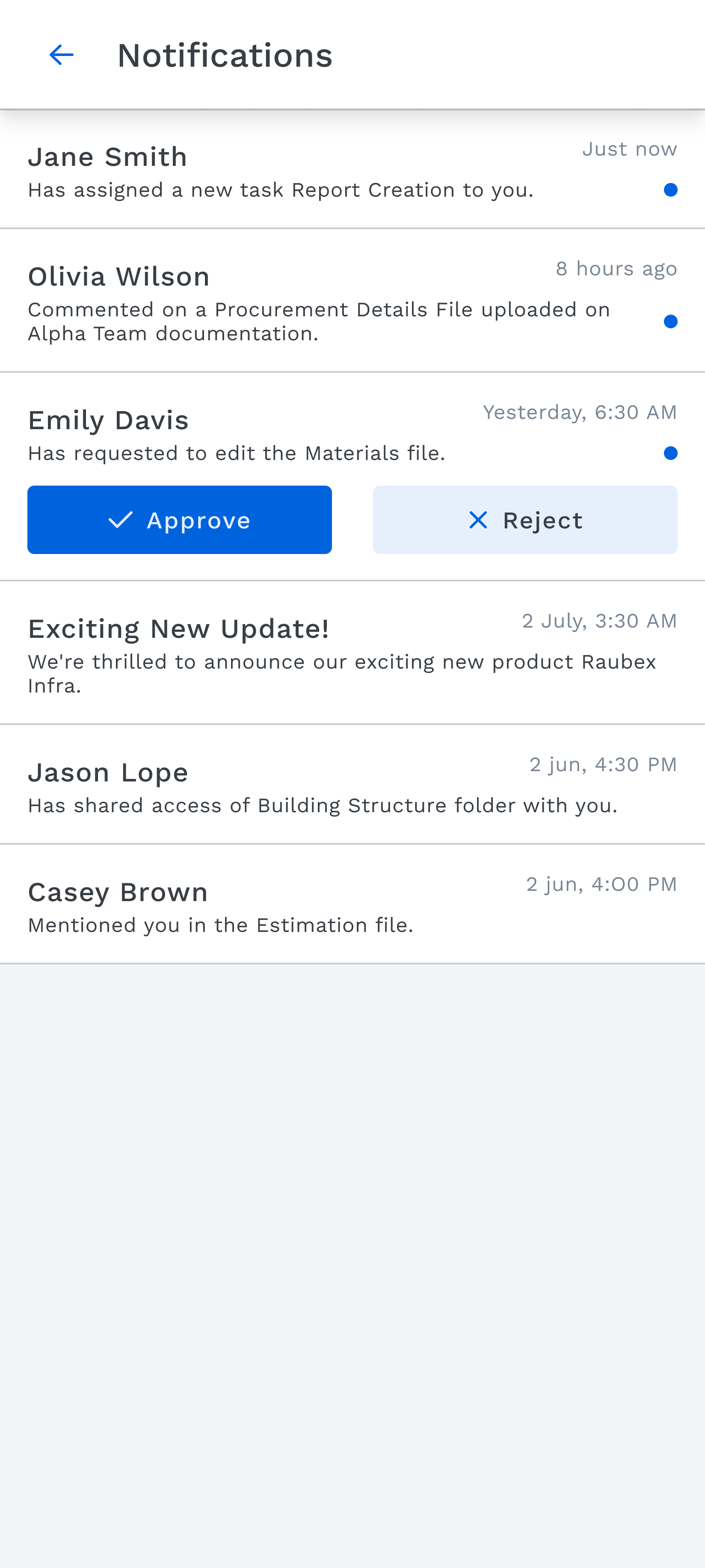
Notifications
Process management stage environment
What shipped:
Process Management has launched in the European market. The Observations feature is live in development. Site Diary is currently in development. The task drawer simplification shipped and is in active use by pilot participants.
What the pilot told us:
Across 10 sessions with real construction professionals, the tool consistently resonated — particularly the structured workflow, the single-source-of-truth approach to task documentation, and the Discussion tab as a place to both communicate and act.
What I'm proud of:
Being selected to represent design thinking in a strategic cross-product conversation in Cape Town — and presenting a working integration concept to stakeholders — was the clearest signal that design was being treated as a strategic function, not just an execution layer. That's the kind of seat at the table I work to earn.
What I'd do differently:
The pilot research was invaluable, but with only 10 participants and sessions spread across months, synthesis was always racing against the design schedule. I'd now advocate for a shorter, more intensive research sprint at the start — even 5 sessions in one week — to front-load the insights before any high-fidelity work begins. The Dovetail AI synthesis helped significantly, but the input quality still depends on getting the right people in the room early enough to influence the right decisions.
I'd also push harder for mobile-first thinking from day one. The mobile designs surfaced constraints — voice input, offline attachments, camera-first observation capture — that would have sharpened the web designs if we'd designed both platforms in parallel from the start, rather than treating mobile as a follow-on.
The AI sprint changed how I think about prototyping entirely. Building a working, deployable prototype of the Task Locations feature in a week — in real code, handed directly to developers — compressed what used to be a weeks-long back-and-forth into a single handoff artifact. I'd now advocate for this approach much earlier in the process, not as a sprint activity but as a standard part of how complex interactions get specified and validated.
Where things stand now:
Following a recent re-organisation, the product has grown large enough to warrant dedicated platform ownership. I now lead mobile design for Process Management end-to-end, while my colleague in Denmark leads web. The work described in this case study — across both platforms — reflects the foundation that made that structure possible.