**This project was completed in 2022–2023, before AI tools became common in enterprise design. All work was done manually.
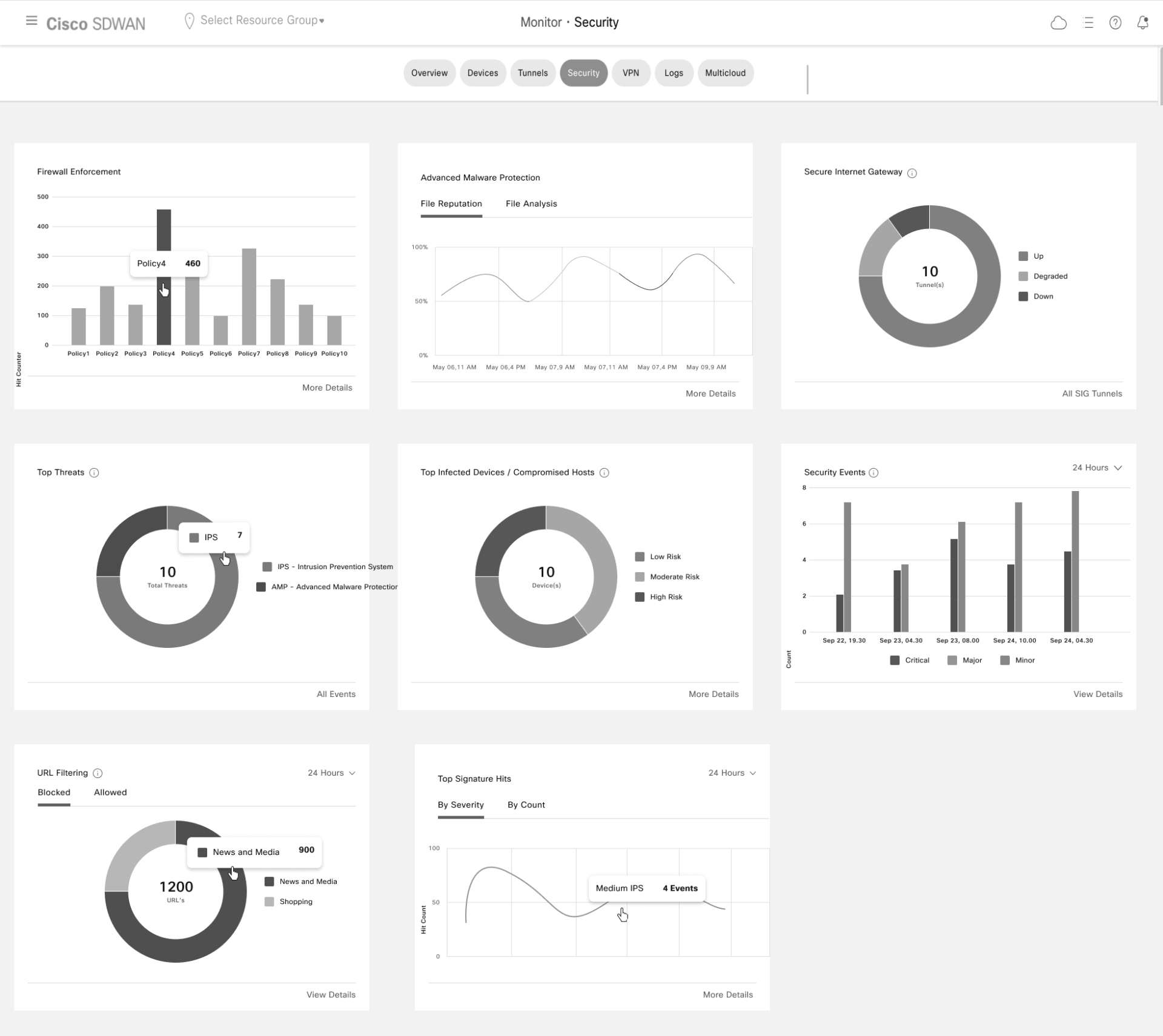
Cisco SD-WAN's vManage platform gives network security teams visibility into their entire network — but the existing security dashboard wasn't delivering on that promise. Dashlets surfaced raw data without context, offered no way to drill down into what mattered, and lacked the hierarchy a Security Operations user needs to triage and act quickly.
The opportunity was significant: a more capable security dashboard would directly increase customer adoption of Cisco SD-WAN's security features and sharpen Cisco's competitive position against rivals already investing in richer, more interactive security analytics.
My mandate was to redesign the existing widgets and introduce new ones — building a dashboard that gives SecOps users actionable intelligence, not just data.
This was one of my first Lead Designer roles at Cisco. I owned the full design process — research, information architecture, design strategy, and delivery — and was responsible for aligning PM, TME, and Dev on every decision.
Role Lead Designer
Duration 2.5 months
Team 4 members
( 1 Designer, 1 Product Manager, 1 Technical Marketing Engg, 1 Dev Lead)
Contribution
Interaction Design - 100%,
Visual Design - 20%,
Research - 100%
1. Building a shared understanding of requirements
The PM and I ran structured requirement analysis sessions for every dashlet on the dashboard.
Rather than working from a vague brief, I created a per-dashlet questionnaire that forced early alignment on the fundamentals:
What is this dashlet about?
Why are we designing it — what is the user's goal?v
How are we achieving that goal?
What are the edge-case scenarios?
What data does it need?
Working through this questionnaire with the PM surfaced assumptions early, caught scope gaps before they became design rework, and gave me a clear decision framework I could reference throughout the project.
Dashboard Brainstorming
Requirement Document
2. Diagnosing what was broken
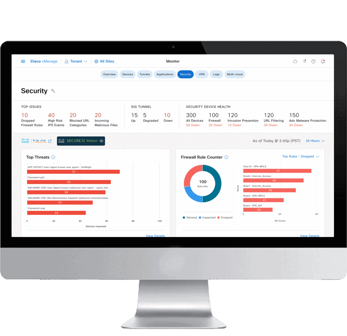
Before designing anything new, I needed to understand what was actually wrong with the existing dashboard — not just what the PM wanted to change. The audit revealed four compounding problems:
No meaningful signal.
Dashlets displayed data but not insight. A security analyst looking at threat volume had no way to tell whether a number was high, low, expected, or alarming.
No path forward.
There was no drill-down. When something looked wrong, users couldn't get from the dashboard to the detail that explained it.
No hierarchy.
All information was presented with equal visual weight, which meant users had to read everything to find anything. The cognitive load was high; the decision support was low.
The data didn't connect.
Individual dashlets existed in isolation. There was no thread connecting a KPI on the dashboard to a meaningful action in the product.
These weren't cosmetic problems. They were structural — and they set the direction for every design decision that followed.
Existing Security Dashboard
3. Research — Understanding the SecOps user
I anchored the redesign in a clear user model. I drew from the company's existing persona repository, which covered four distinct Security Operations roles: Chief Information Security Officer, Security Manager, Security Analyst, and Security Operator.
Rather than designing for all four independently, I synthesized their common responsibilities, pain points, and needs into a single "Generic SecOps User" — a composite persona that captured what all four roles share: the need for fast threat triage, clear escalation paths, and confidence that they are seeing the full picture.
This persona served as a decision filter throughout the project.
When stakeholders debated whether to include a data point, the question became: does this help the SecOps user act faster and more confidently? If not, it didn't belong on the dashboard.
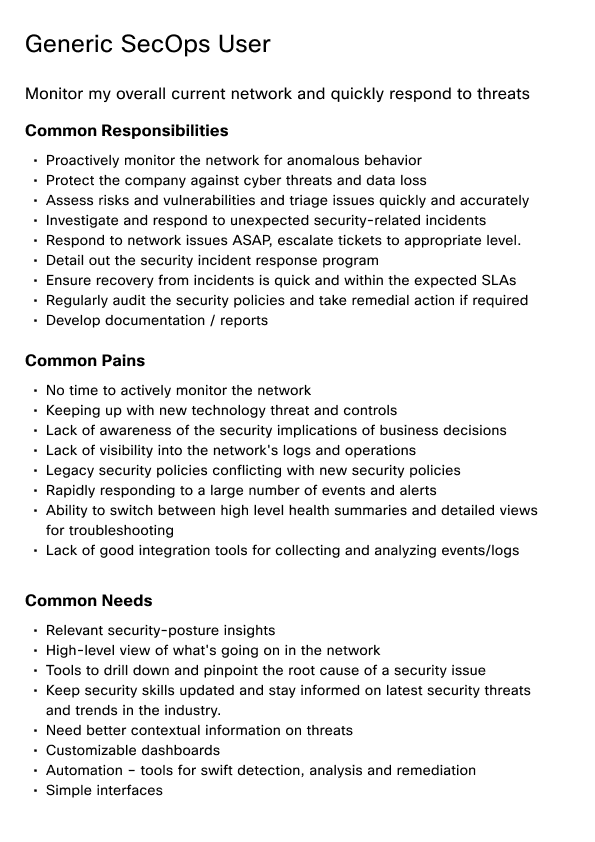
SecOps User Persona
4. Research — Competitive analysis
I studied security dashboard implementations across Cisco competitors and adjacent Cisco applications dealing with network security. The goal wasn't to copy — it was to identify the design patterns that best-in-class security dashboards use to solve the exact problems I'd diagnosed: progressive disclosure, KPI-first hierarchy, interactive drill-down, and contextual cross-linking.
The competitive analysis became the visual and structural benchmark for the redesign.
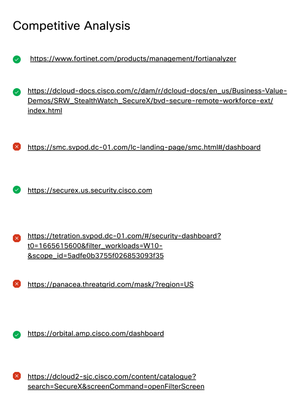
References
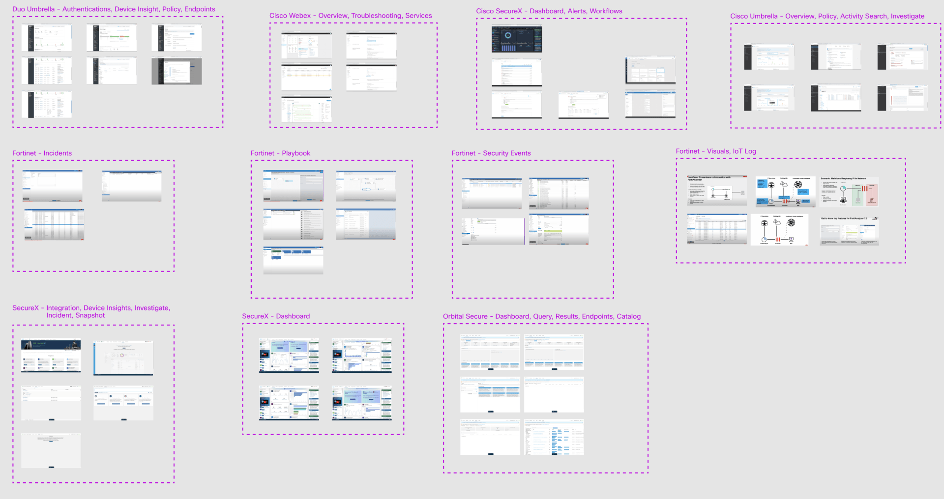
Competitive Analysis Synthesis
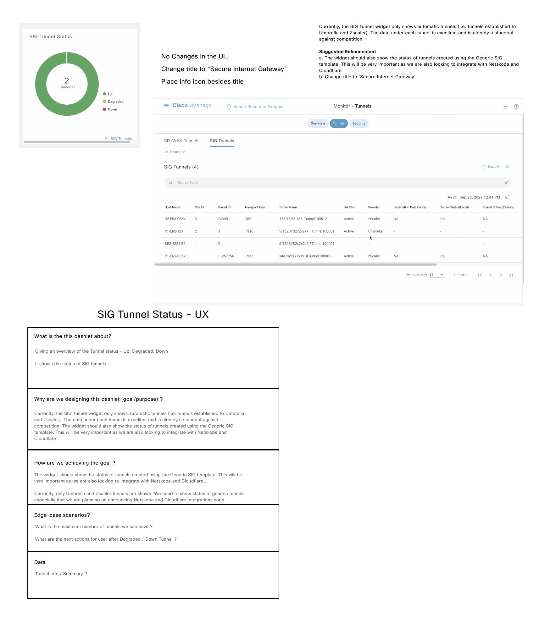
5. Information Architecture — designing the navigation backbone
Before touching any visual design, I mapped the full dashboard sitemap: every widget, every drill-down destination, every cross-launch link to external Cisco security applications.
This step was critical for a reason the original dashboard had missed — the dashboard didn't exist in isolation. It needed to connect seamlessly to existing vManage pages and to third-party Cisco products like Talos and SecureX. Building new UI where existing UI already worked would create duplication and inconsistency.
The sitemap was peer-reviewed multiple times before it was locked.
Every link in the final design traces back to a decision made here.
(Click on the Info Architect image to see it full screen)

Dashboard Sitemap
6. Design — from sketch to reviewed UI
I started with black-and-white sketches using placeholder data to explore layout and flow without visual noise getting in the way. The sketches were reviewed with PM first, then went through multiple rounds with the TME and Dev Lead before any high-fidelity work began.
This review cadence was intentional. TME brought real-world customer scenarios that stress-tested the design. Dev brought implementation constraints that shaped what was feasible in Phase 1 versus Phase 2. Getting both perspectives early prevented late-stage rework.
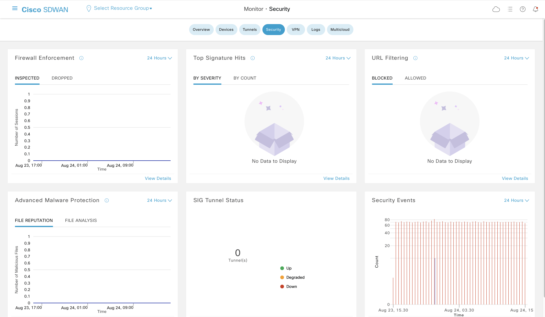
Security Dashboard
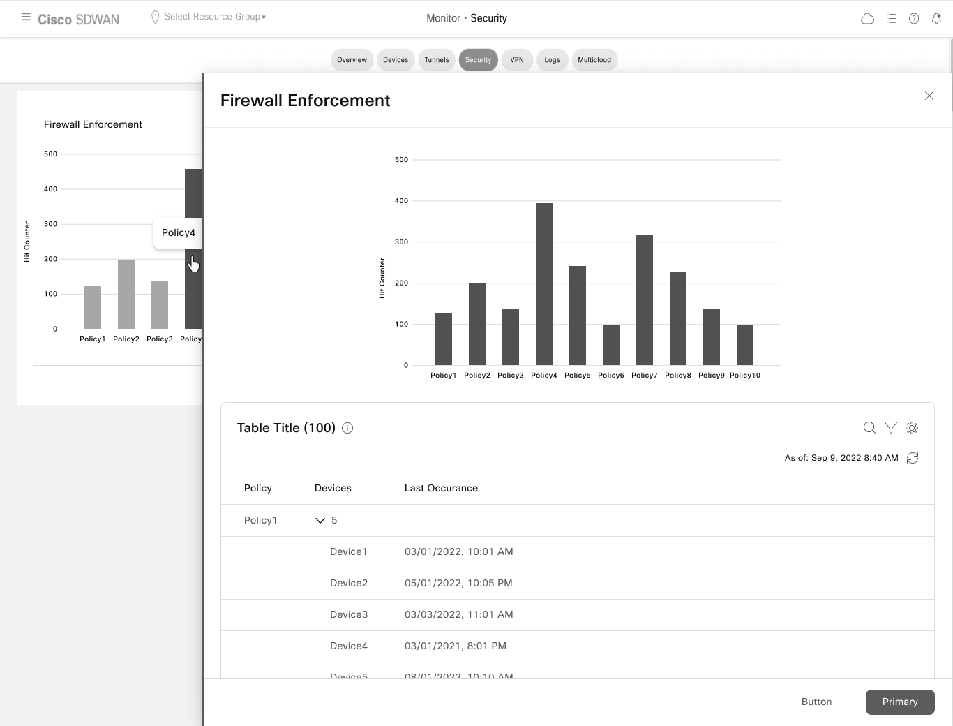
Firewall Enforcement Details
Final Design
Final design is created in Figma using the ‘Cisco’s cohesion design system’ components.
It covers four core user flows:
Customizing the dashboard layout
Hero bar navigation for cross-dashboard orientation
Cross-launch to Cisco's security ecosystem — Talos, SecureX
Six redesigned dashboard widgets with drill-down paths to detail pages
Each widget was redesigned around a single guiding principle: show the SecOps user what they need to act, not everything that could be shown. KPIs are foregrounded. Context is surfaced inline. Drill-down is always one click away.
Phase 1 was approved by the VP of Engineering. Phase 2 — focused on further reducing cognitive load and click depth — is scoped and ready.
(Click on the individual pages to see them full screen)


What shipped:
Phase 1 approved by VP of Engineering and in development. Phase 2 requirements are scoped, with planned user research on the Phase 1 design informing the next iteration.
The outcome I'm proud of:
The 200% usability improvement came from one core shift — moving from a data-display mindset to a decision-support mindset. The old dashboard answered "what is happening." The redesign answers "what should I pay attention to, and where do I go next." That framing guided every widget decision and is what made the difference measurable.
The leadership moment:
This was one of my first Lead roles at Cisco, and the thing I had to learn fast was that leading design means leading alignment — not just producing good screens. The per-dashlet questionnaire, the sitemap peer reviews, the structured TME and Dev review cadence were all mechanisms I put in place to keep a four-person cross-functional team moving in the same direction. The design quality depended on that process working.
What I'd do differently:
With AI tools now available, I'd approach this project differently in three ways.
First, I'd use AI to synthesize the competitive analysis faster and more systematically — processing patterns across multiple dashboards to surface design conventions and outliers in hours rather than days, leaving more time for the harder strategic questions.
Second, I'd validate the SecOps persona earlier using AI-assisted synthesis of available signals — support tickets, NPS data, product usage analytics — before committing to a composite persona built primarily from the internal repository. A proto-persona grounded in live customer data would have given me sharper prioritization criteria from day one.
Third, I'd use AI to model the Phase 1 / Phase 2 feature sequencing more rigorously — mapping dependencies between widgets, identifying which combinations of features would deliver the most measurable usability gain in the first release, and stress-testing the release plan against real adoption risk before presenting it to the VP.